
Slide Makeover
Avoid Death By PowerPoint With The Scissor Technique™
4 Min Read
 |
Henry Low | 23 Aug 2015 |
Most presenters’ slides are extremely boring.
Have you wondered if you are killing your audience with bad presentation slides?
There is a term coined to describe this phenomenon – Death by PowerPoint.
Of course, the cause of this trouble has nothing to do with the presentation software. It is largely due to the poor usage of the software.
Let us learn how to fight against it.
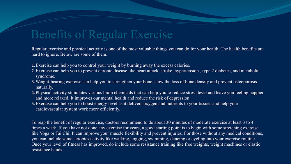
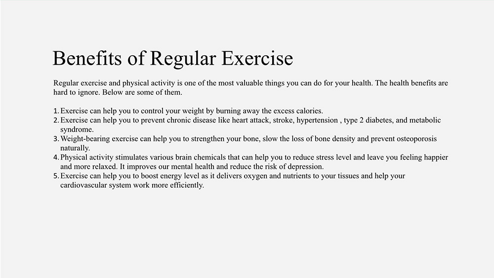
Below is one example of a slide that you may have encounter or have created for your own presentation.
Such presentation slide overloads your audience with data and information.
In my opinion, this is not a slide. It is a document!
Your audience will attempt to read them while you speak and become distracted.
They will miss the key message that you are trying to convey.
What should I do?
Well today, I am going to show you a technique that almost guarantees you a simple yet professional looking slide that will wow your audience.
So, do not kill people with bad presentation.
Keep reading to learn how…
The Scissor Technique™
Recently I shared this technique to a group of friends.
After they understood it, they simply cannot believe that they can revamp their own slides in just a few easy steps and achieve a designer grade slide.
The best part?
You can do the same thing for your presentation too… even if you believe you do not have any artistic talent.
The 3 Steps to Using “The Scissor Technique”
To Get An Amazing Looking Slide
Here are the 3-steps that make up The Scissor Technique.
Step 1: Identify one key message
Step 2: Highlight the key points
Step 3: Enhance with visual
Have you ever saw a wordy slide and said to yourself:
“Wow, this is a great slide! I am impressed by how much information the presenter has managed to squeeze into it.”
Of course not!
People naturally like simple and beautiful things.
You may have heard before the phrase “Less is more”.
While most people fear they have not include sufficient content and attempt to cram tons of information into the slide, your task is to cut out as much information as you can.
Step 1: Identify one key message
Using the example above, the first step is to take a good look at the slide content.
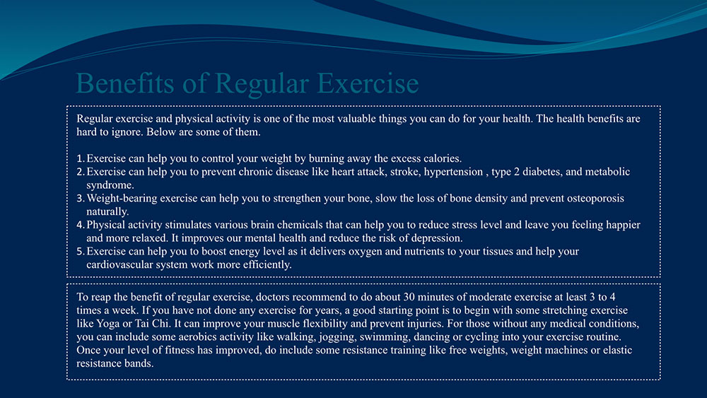
Identify the various key messages in it.
The first message is the benefit of regular exercise and the second message is the type of exercise you can perform.
Each slide should contain only one key message that you want to bring across to your audience.
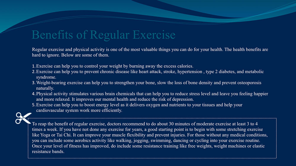
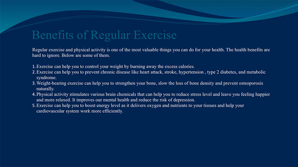
Let us cut away the second message and move them into another slide.
The background does look a bit outdated and boring.
Let us remove it for now.
Step 2: Highlight the key points
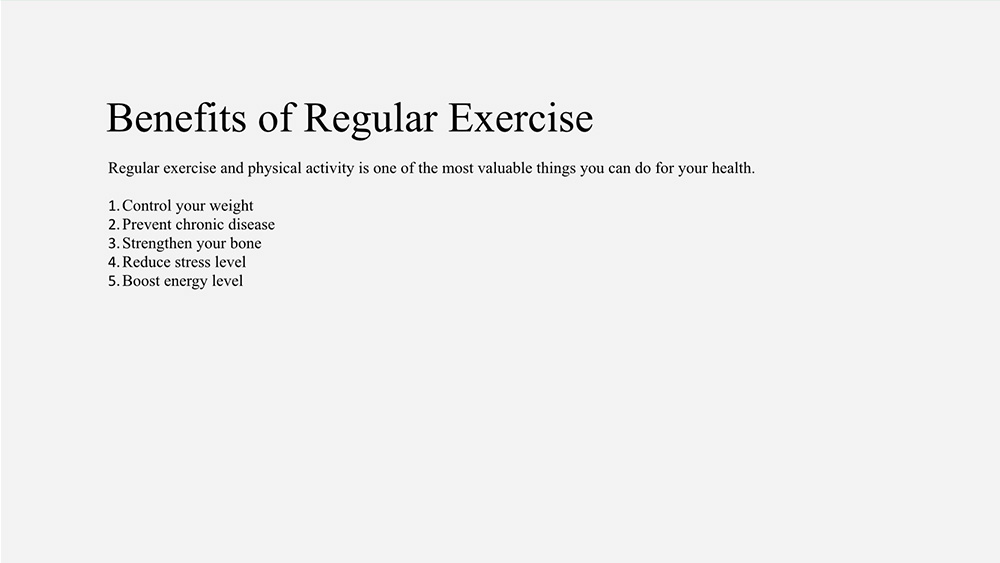
The next step is to take the remaining content and cut it further.
Here is how you can do it.
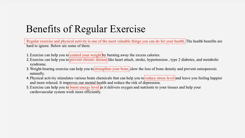
Read the text and highlight out the various key points.
Next, keep the highlighted content and cut away the rest of the text.
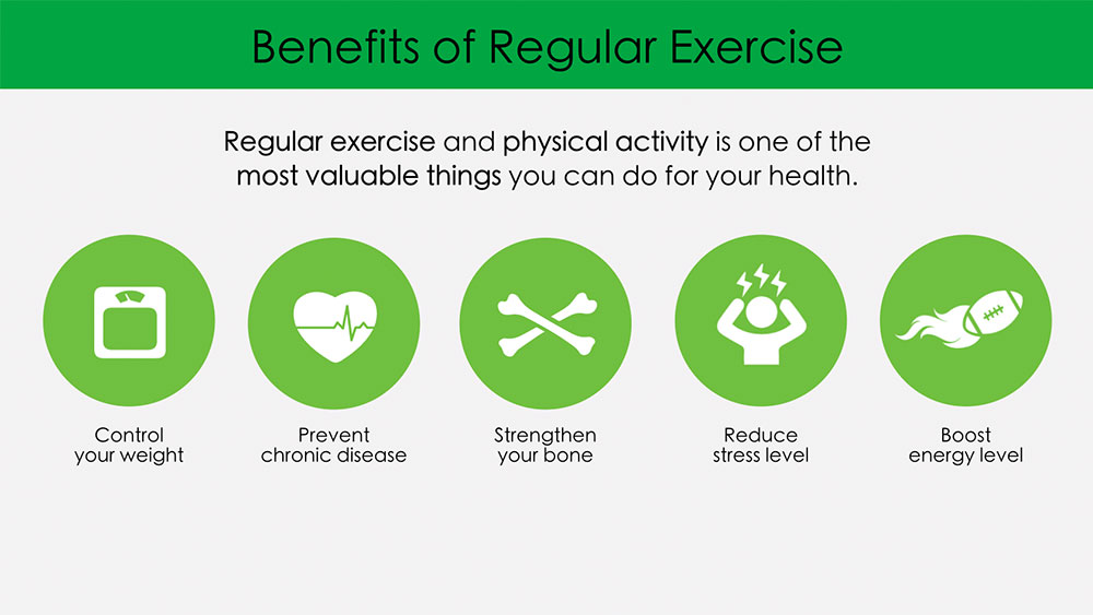
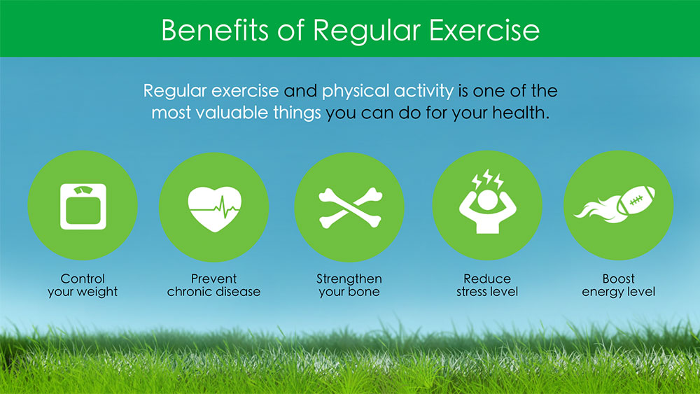
Step 3: Enhance with visual
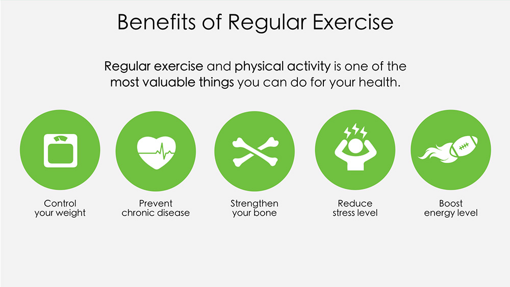
For each phrase in the list, find an image to represent it.
Lay out the images in a neat structure and caption each image with the key phrase.
Image taken from Envato Elements
I believe you will agree with me that this slide is visually more interesting.
It is far more effective in bringing across the key message to the audience.
Now You Try It
I hope you can see the potential of The Scissor Technique.
It is a powerful way to transform a wordy slide into something simple yet able to convey the message and without losing the essence.
Yes, it takes a bit of time to create a great looking slide.
But with this actionable strategy in hand, you already know ahead of time that your audience is going to be alive and the extra effort you put in is well worth it!
Ready to get started?
Leave a quick comment below to let me know how this technique has helped you.
[Update – 19 Sep 2015]
Ellen Finkelstein, a well-recognized expert in presentation skills, shares a tip in the comment section on how to further improve the slide.
It is a good suggestion! You can read more about it below.
Here is the improved slide based on her advice.
Image taken from Envato Elements
From The Web

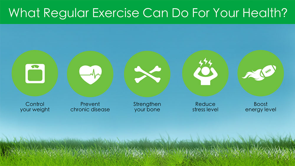
I love it! Very clear and systematic. And the icons work very well. I’d add one more thing — put the point of the slide in the slide title. In your example, you’d get rid of “Benefits of Regular Exercise” and put the main point, which is used as a subtitle, in its place. To make it shorter, I’d say “What regular exercise and physical activity can do for your health.” See how that will further simplify the slide?
Hey Ellen,
A big thanks to you for the comment! Really good point. I have incorporated your suggestion into the article.
Good ideas for these articles. I like it.
Your style is really unique compared to other people I have read stuff from. Thank you for posting when you have the opportunity, Guess I will just bookmark this blog. Loralyn Aharon Liz
Article is really excellent. Every time I read it,
Really thank you for this beautiful article, it was a very informative articlee.
Thank you for this beautiful article. It’s really a good article
Way cool! Some very valid points! I appreciate you penning this
post plus the rest of the website is also really good.